
01
DESIGNING VALUE
About // Individual project
Merchbar is an e-commerce website where fans can discover and buy merch from their favorite bands. Currently Merchbar's information architecture and checkout process is complex but most importantly, it fails to fulfill the need behind the user's purchase decision, the need to support the artist. In this project, my research demonstrates the importance of empathy to design experiences that incentivize purchases and create customer loyalty.

COMPANY
Merchbar
ROLE
UX Designer
DURATION
2 Weeks
02
RESEARCH
User Interviews // Affinity Mapping

I began my research by conducting 3 user interviews and asking about:
-
latest experience purchasing merchandise from their favorite artist
-
when, how, and where they buy merchandise
-
their motives behind the purchase
-
how they ensure their purchase will support the artist
-
what makes the product authentic
THE FOUNDATION OF MY FRAMEWORK
01

02

03

03
THE USER
Persona // The Problem // User Flow

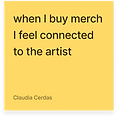
After my research, it was clear that users were purchasing for one specific reason, the need to support their favorite artists. I conducted a feature analysis against Merchbar comparators and this key motivation wasn’t being met throughout the customer journey on any site. This was a key finding that could differentiate Merchbar in the industry.
JAMES: THE MUSIC PRODUCER
Goal: Buy merch before it’s sold out and ensure my purchase will support the artist - not the record label.

Behaviors:
-
Becomes aware of new merch through Instagram
-
Prefers online shopping
-
Merch makes him part of a community
Needs
-
A notification system
-
Accurate sizing descriptions
-
Ensure his purchase supports the artist
THE PROBLEM
Music fans need trusted sources to buy artist merchandise from because they want to know their purchase is making a difference.
UNCOVERING MENTAL MODELS
One user pain point I wanted to tackle was sold out items. Evidently cross-platform migration causes a delay between the awareness and consideration stage of the user. Additionally, the website’s information architecture delays the customer from purchasing a product that’s selling out fast. To understand how I could decrease that timeframe, I decided to use card sorting and identify what categories and filters would facilitate the search process.


04
DESIGN
Wireframes // Usability Testing // Prototype
DESIGN PROCESS

After card sorting, I was able to simplify the categories into Clothing, Decor, and Music Genres. This helped me create the sitemap with respective subcategories based on their pairings. Merchbar's current website overwhelmed the user with multiple repeated categories on the homepage. The same elements were on the navigation and below the search bar, confusing the user.
USABILITY TEST RESULTS
TAKEAWAYS
TEST GOALS
1. User will search an artist and purchase a hoodie in one attempt.
SUCCESS
3/3
All users expressed they are likely to return because they liked seeing how much their purchase contributed. This increases the credibility of the website.
2. User is able to search and purchase a hoodie in less than 2 minutes.
Some users liked to see estimated shipping in the product details pages and others expected it during the checkout.
AVERAGE
48s
05
THE SOLUTION
High Fidelity Prototype // Lessons Learned

Based on my usability testing, I decided to change the shipping information initially on the product detail page into the checkout process. I also increased the size of the fonts and implemented a pop-up window for the sizing guide since users had trouble reading them.

LESSONS LEARNED:
Users already have set expectations on how a checkout process is based on previous websites. Even though users might express interest in a feature (such as knowing estimated shipping), if it contradicts established flows, it's going to create discomfort.


